Tools & Tips for Artisits
Painting With Watercolours
Painting with watercolours is distinctive and watercolour paintings are unmistakable. It has delicate luminosity of transparent colour.
This unique medium is not without its share of challenges. Many find watercolours hard to control, and if your first experience with painting was with an opaque mediums like oils, acrylics, the process of watercolour painting can feel "backwards".
Painting with watercolours can be difficult. It is a hard medium to master, largely because it can be unforgiving and unpredictable. Its fluid nature makes it hard to control the mistakes. It is as direct of a medium as can be, there can't be any hesitancy while you are painting. You have to decide where you will place each brushstroke of colour and then let it do its magic. Colours can be applied boldly, with broad, loose strokes, implying the subject, rather than describing it completely.
While painting with watercolours, time is off essence. The speed at which the water dries on the paper determines the how the pigment responds to it and what effect it creates. Therefore, the quality, thickness and the content of watercolor paper are very important decisions. The best paper to use should be 100% cotton.
This wonderful medium lets you understand the joy of the brushwork, colour and emotion are a visual enjoyment to the eye ! Certain colours do things with other colours when placed down and many things happen on dry and wet surfaces that you just can't explain.
Color Basics
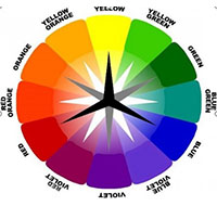 The 12-part Color wheel is a representation of the visual spectrum of light that us humans can actually see. Each color has a specific wave frequency that our eyes perceive as different color sensations.
The basic color groupings that concern artists are the Primary colors (3), the Secondary colors (3), and the Tertiary colors (6).
The 12-part Color wheel is a representation of the visual spectrum of light that us humans can actually see. Each color has a specific wave frequency that our eyes perceive as different color sensations.
The basic color groupings that concern artists are the Primary colors (3), the Secondary colors (3), and the Tertiary colors (6).
Hue refers to the color name, as in red, blue, and yellow. Color saturation is to the strength of color and the chroma is the grayness in a color, achieved my adding white or black.
Value refers to a color’s lightness or darkness on a gray scale.
Transparent Colors: Transparent colors appear more intensely hued when laid on white paper. They are excellent for working in layered washes. You can only glaze and tint darker washes with a transparent color. Whatever is underneath will show through. Transparent colors include: Phthalocyanine blue, phthalocyanine green, phthalocyanine green, phthalocyanine violet, scarlet lake, rose madder, permanent rose, new gamboge, Hooker’s green, cyanine blue, Indian yellow, coral.
Opaque Colors: Care must be used when using opaque pigments in transparent watercolor painting. Using Opaque colors on top of other washes can result in a chalky appearance and can muddy up underlying colors. Opaque Colors include: Cadmium Yellow, cadmium red, cadmium orange, venetian red, yellow ochre, emerald green, cerulean blue, Naples yellow.
Reflective Colors: Due to their innate molecular structure, reflective pigments are rather chalky and tend to “ride the surface” of a painting. This is true physically as well as visually. Reflective colors include: Cobalt violet, cobalt blue, raw sienna, viridian green, aureolin yellow.
Staining Colors: Man-made dye-based pigments stain your paper the most. Many are intense in hue and have a proven track record for greater permanence. In general, mineral based, and natural plant and earth pigments have less staining power. Emerald green, permanent rose, manganese blue, aureolin yellow and cobalt violet are non-staining colours. Gold Ochre, raw umber, cadmium orange, cobalt blue, gamboge yellow, cerulean blue and magenta are called Light Staining Colors.
Heavy Staining Colors: Phthalocyanine blue, phthalocyanine green, phthalocyanine violet, dioxazine purple (Winsor violet), alizarin crimson, scarlet lake, sap green, Hooker’s green.
Fugitive Colors: The pigments in the “fugitive” class of paints have the unfortunate characteristic of looking beautiful and unique when first painted but show bad side-effects over time. Side effects include fading to non-existence, changing color, darkening to black, and other fun stuff. Many in this class of colors were organic plant materials first used to make pigment for watercolor paints, like the madders. Fugitive include opera, alizarin crimson, anything with the word madder, or even gamboge.
Watercolour tools: Paint, Paper, Brushes and other tools
Use Quality Paints
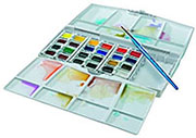 Quality matters. The materials that you use greatly influence the results that you can expect. Many artists decide to purchase cheaper brands in order to "see if they like it", before committing a few more dollars to higher quality paints.
While this is a good approach to some mediums, watercolor is different. There is a broad spectrum of quality. Using lower quality materials inevitably leads to lower quality results. It is wise to spend a little more on the higher quality paints in order to give your experience with watercolor a "fair chance".
Use the Right Paper
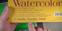 The surface in which watercolor is applied is extremely important. Surfaces must be water-absorbent and capable of accepting multiple washes of color.
The weight of the paper refers to the weight of one ream of paper (500 sheets). The heavier the paper, the better suited it is for watercolor applications.
I recommend using paper that is at least 140 lb. (300 gr).
Watercolor papers are produced as cold press, hot press, or rough. These designations refer to the process used to make the paper. Cold press papers are pressed on cold cylinders. Hot press papers are pressed on hot cylinders. Rough papers are pressed without the use of cylinders and feature the strongest texture.
If the wrong paper is used, buckling can occur. While many manufacturers produce papers that are labeled as "watercolor paper", using this paper does not guarantee that the paper will not buckle. The best indicator is the weight of the paper.
Use the Right Brush
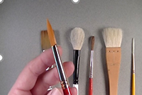 Brushes for watercolor painting are varied and there are no clear rules for which brush you should use. However, brushes with softer bristles and pointy ends are typically preferred.
Experimentation will often lead to finding the right brush that fits with your style, but synthetic brushes are good place to start.
They are inexpensive compared to many natural hair brushes like sable.Stiffer brushes, like hog bristle, are generally reserved for textural effects and are not used for general applications.